Donors who give on a regular basis via Direct Debit are an extremely valuable group for a charitable organisation, but when trying to evaluate their financial worth things become slightly complicated. In this blog post I'll describe how to create the above visualisation in Tableau (using dummy data) as a way of demonstrating the value of Direct Debit donors - and, conversely, the cost of Direct Debit donor attrition.
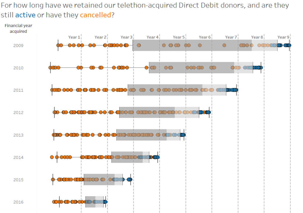
Now I've written before about how you really need to take the long-term view when assessing the value of a given acquisition channel, but I didn't refer very much to Direct Debit donors in that post. The main reason for this is because we're not talking about a single payment in this case, and because we can't know for sure how much in total these donors will contribute we sometimes project how much we can expect from them over a given period of time - in UK higher education we take 5 years as the default, in accordance with the Ross-CASE benchmarking guidelines. But is 5 years a realistic length of time over which to expect a donor to give on a regular basis? And if it isn't, then for how long on average does a Direct Debit donor give before cancelling their recurring payment?
These are the sorts of questions you might hear from direct marketing managers at your organisation, but my instincts tell me that these aren't perhaps the correct questions to ask. After all, whatever average we calculate today will look rather different months from now as what we're looking at isn't fixed - so we need a way to visualise the length of time over which Direct Debit donors are actively giving, and to highlight in trends in when they cancel.
There are five crucial pieces of data you'll need in order to build this chart:
- A unique identifier for each Direct Debit donor (known as Constituent ID if you're using Raiser's Edge as I am)
- The status of the Direct Debit - is it still active, or has it been cancelled?
- The date on which this donor set up their Direct Debit, and the period that falls within. I'm using Financial Year, which runs from August to July at my institution, but you may choose calendar year or something else entirely
- The date on which inactive Direct Debits were cancelled
- Using the above two dates, the Direct Debit retention period (in days)
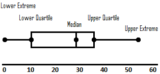
With this information to hand, you're ready to build box plots in Tableau. For those of you unfamiliar with box plots, hopefully the diagram below pulled from Wikimedia will help with how to read them:
For those of you who are new to Tableau, building this isn't as complex as it may seem: just drag the Financial Year acquired dimension into Rows (drag it into Dimensions first if it appears in Measures, and make sure it's Discrete), then drag the sum of the Retention Period into columns, the unique identifier into Detail (so that we're breaking it down to the constituent level), change the marks to circles, and finally drag Direct Debit status into Colour so that we can define active and non-active Direct Debits.
I show you how this is done in 25 seconds below...
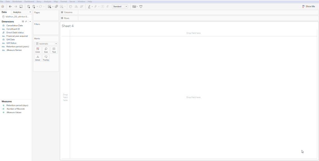
Next you'll need to do a bit of formatting, so begin by adding a dark border to your circles (it helps to keep their shapes defined when they overlap), then enlarge the font for the Rows (12pt perhaps for the values, and 14pt for the header). Now let's make our box plots by adding a reference line: right click on the X-axis to activate the Reference Line window, and select Box Plot from the options at the top - again, feel free to play around with the format if you'd like, but I've left it as the default. Before you hide the Columns header, add a series of reference lines to it at intervals of 365 days to mark where the end of each years falls - thus making it easier to read the chart as described below.
Finally, create a calculated field called "Retention period (years)" with the following value:
if INT([Retention period (days)]/365) = 0 then "less than a year"
else "less than " + str((INT([Retention period (days)]/365)+1)) + " years"
END
- Look at the start of the shaded area in each year, where everything up to that point represents a quarter of each year's Direct Debit donors. See how it's shifting leftwards? So long as all the dots up to that point are orange (cancelled DDs), we can conclude that it's generally taking less time for a quarter of the Direct Debit donors acquired in a given financial year to cancel.
- Look at the first orange dot in each year. The fact that in FY2009 it appears quite far to the right whereas from FY2011 there are lots clustered far to the left tells us that the time it takes for a Direct Debit donor acquired in a given financial to cancel has decreased.