For about two years now, and possibly for longer, I've been suffering from depression. It's been a struggle admitting this to myself and making positive changes in my life, and although I still have some way to go I do feel hopeful about the future.
I've recently quit my job to start freelancing, and it's given me some time to reflect on things. One of the things I've been reflecting on is the progress I've made in my professional life, and given that my efforts in Tableau form a part of that progress I wanted to look back on how far I've come using the tool over the last two years (oddly enough, that's the same length of time that I've been conscious of suffering from depression - though I don't think the two are connected!). The most important reason for doing so is because depression can make us think we're not good enough at something, but in tracing my progress over time I might be able to convince myself otherwise.
To do this, I'm going to look at each of my Tableau Public submissions since my first in early 2016. There have been ten in total, and for each one I'm going to describe how and why I did what I did, and why I think each one is an improvement on the last (you can click on the images to go to the interactive visualisations on Tableau Public). Here's the first, from April 2016...
NHS Wales A&E Waiting Times

Background
These are the sorts of projects I enjoy most: taking publicly-available data about an important social issue, and telling a simple story about it. I had the idea for this after seeing my friend Rob Osborne tweet about NHS Wales's Accident and Emergency waiting times: there's a target of 95% of those waiting in A&E to be seen in less than 4 hours, and the data showed that not only were NHS Wales failing to meet it, but in the first quarter of 2016 they were moving further away from it every month. The NHS is underfunded across the UK, but Wales in particular has been struggling to cope - especially during the winter months.
What I like about the visualisation
The red bars immediately draw the viewer's attention, and most would rightly assume they represent something bad. The short title confirms that: "2016 has started badly for A&E waiting times in Wales". We can clearly see how far each month falls short of the target (represented here by the dashed line), and how it's falling further each month in 2016. I've linked to the original data in the footer, and I've labelled my axes - although that does create some confusion with the bar labels, which actually show the monthly percentage change. Still, with a bit of work I think this shows the problem quite well using a simple bar chart and a couple of contrasting colours.
The Rise and Fall of the Soviet Union

Background
This was my first submission to Makeover Monday, a weekly initiative (currently overseen by Eva Murray and Andy Kriebel) where members of the Tableau community take an existing visualisation and try to improve it. This was week 32 in 2016, and the data consisted of the all-time medal standings from the summer Olympics. I decided to narrow in on the USA and Soviet Union, showing how they competed for sporting supremacy from 1952 to 1988.
What I like about the visualisation
Like the NHS viz, it's a simple bar chart with two contrasting colours. I like the use of red for communist Russia, I like the annotations that tell a simple story, and I like how the subtitle neatly summarises what's going on here: "during the Cold War, the United States came first in the medal count in just four out of the ten Summer Olympics held." On the downside I didn't cite my data source and left the default tooltips in, but given the amount of time I recall spending in the attempt to find an interesting angle on the data I'm pleased with the final result. To my surprise, this remains my most-viewed viz on Tableau Public.
The Power of Potter
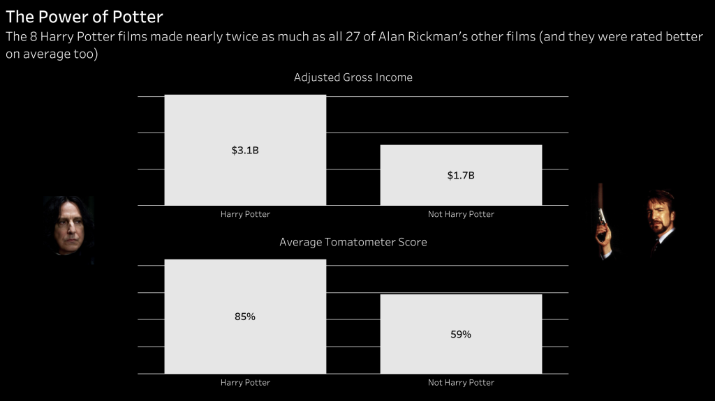

Background
The great Alan Rickman passed away in early 2016, and later that year the Makeover Monday team released a dataset about how much each of his films made at the box office, as well as their average score on the review aggregation site, Rotten Tomatoes. I immediately had a design in mind for this, and so decided to get back involved with Makeover Monday.
What I like about the visualisation
I used imagery for the first time, with each of the two pictures of Rickman representing the Potter and non-Potter films I was comparing. The dark background seemed apt given his association with the character Severus Snape in the Harry Potter franchise, and I wasn't surprised to see many others in the Tableau community taking the same approach. I relied again on the subtitle to immediately convey the key message to the viewer, and once again I used bar charts to tell a simple story. I remembered to remove my tooltips this time, but I still wasn't citing my data sources as I had done in my NHS viz.
His Story Today, Her Story Tomorrow?
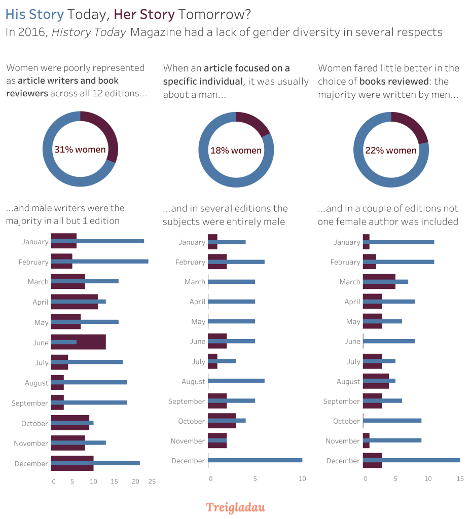
Background
I still have this set as my featured viz on Tableau Public, and there's a reason for that: it tells an important story, and it had a real impact. I blogged at length about the process of building this visualisation here, and I later created a Storify of the response it received which has been archived here.
What I like about the visualisation
The subtitle doesn't tell the whole story this time, instead it draws you in before the doughnut charts and bars clarify what's going on. It's split into three distinct panes, each telling the same story from different angles: women were severely under-represented as both article writers and book reviewers, as historical subjects, and as book authors across the 12 editions of History Today magazine in 2016. I stayed away from crude stereotypes when choosing colours (no pinks and blues), and I used short sentences to guide the viewer along and highlight key points. I'm very proud of this visualisation and the (mostly) positive response it received.
Festive Frugality
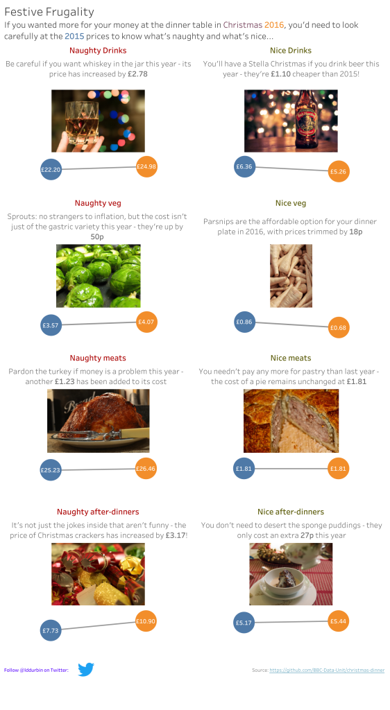
Background
On Twitter I recently described this as my last Makeover Monday until this month, although that's not technically true as I did one for this very blog - I just hadn't uploaded it to Tableau Public, so I won't be covering it here. Anyhow, I had some downtime over Christmas 2016 and thought it would be fun to look at a dataset all about the cost of Christmas goodies.
What I like about the visualisation
I like the alliterative title. I also like how I broke out of the usual landscape view to try my hand at a bit of long-form storytelling, and moved away from bar charts to use slope charts instead - maybe not the best way of showing the change in prices, but I'd only just discovered the utility of using dual axes in Tableau and wanted to try it out (I think I deployed this technique more successfully in the doughnut charts from my previous viz). I used imagery again, and made the effort to source them via Flickr Creative Commons. Finally, I got around to citing my data sources, and even included some information about myself.
An Unequal SET
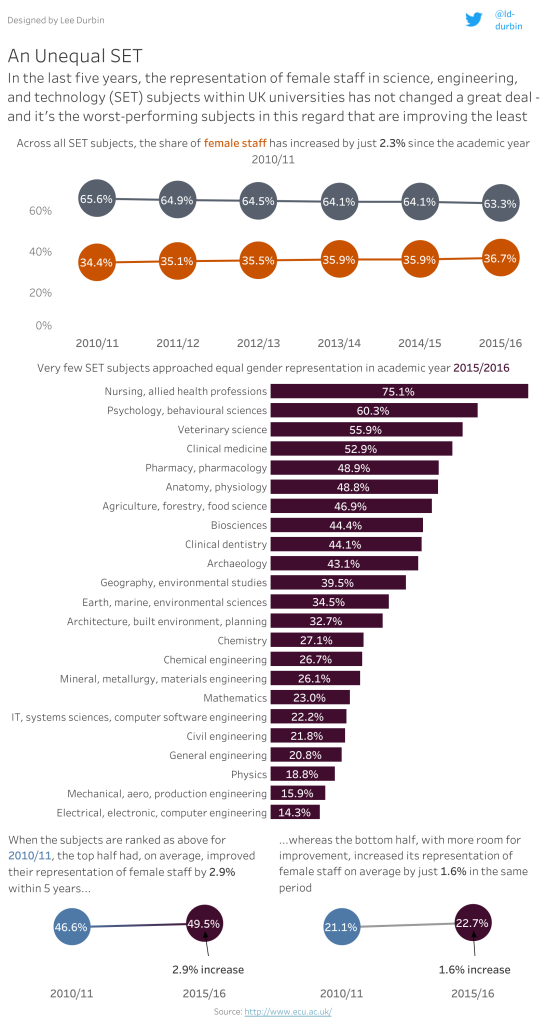
Background
This visualisation was designed after I was invited by Chloe Tseng to participate in Viz for Social Good, an initiative that calls on the community to create visualisations based on datasets released by nonprofits. Chloe noted that very few men had participated so far in January 2017, which was a shame given that month's theme of showing "the challenges for women in STEM" (you can read more about it here). I was honoured to be asked to take part, even though I felt my skills weren't good enough. Still, I did my best.
What I like about this visualisation
This was another longform piece, although far less time was spent on the final visualisation than on finding the right data and a compelling narrative within it. I was trying to show two things: the proportion of women working in SET subjects hadn't changed much in recent years, and the subjects with the lowest proportion of women had improved the least. I wasn't thrilled with the end result given the hours that had gone into getting to the point where I knew what I wanted to say, but like my History Today piece it nevertheless made a simple yet powerful point about gender disparity. I managed to cite my sources and plugged my Twitter handle, and I think the consistent theme that runs through the different charts is clear enough. Even though I'm not crazy about this one, it is my second most viewed viz on Tableau Public - so others certainly seem to like it!
Holly Palmer Consulting Mystery Shopping Results
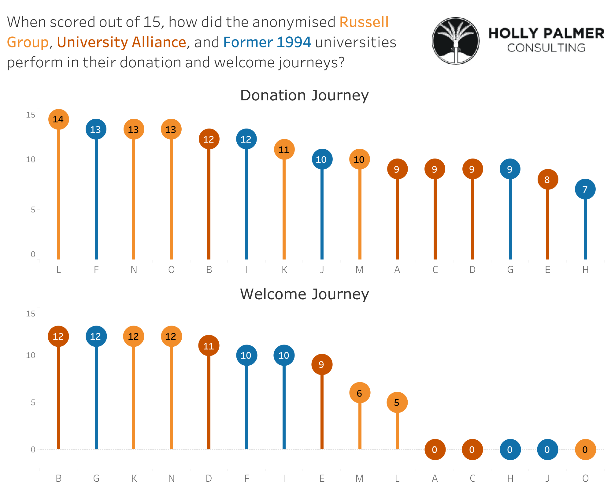
Background
My freelance work is under the banner of Holly Palmer Consulting, a business I run with my partner (the eponymous Holly Palmer). We specialise in fundraising and alumni relations within the higher education sector, and in early 2017 we decided to donate to 15 universities in the UK to experience what it's like being a donor to them. The bottom line is it was pretty uninspiring, a verdict that was based on a scoring system we devised for the donation journey (the experience of making an online donation) and the welcome journey (the experience of being a donor in the first few weeks after making a gift). We released a report that you can read here, and the above visualisation was created for it.
What I like about this visualisation
I read Andy Cotgreave's blog about lollipop charts and felt this was an appropriate use for them. The end result is a fun way of conveying a difficult message, and it manages to show the scores we set for each institution across the two areas we measured whilst allowing the viewer to compare across institutions. I used colour to designate which group the universities belonged to and saved space by labelling them in the text box. I could have experimented a bit further, but as it was meant to be viewed in a report with much more context I felt this was fine.
Fundraising Investment
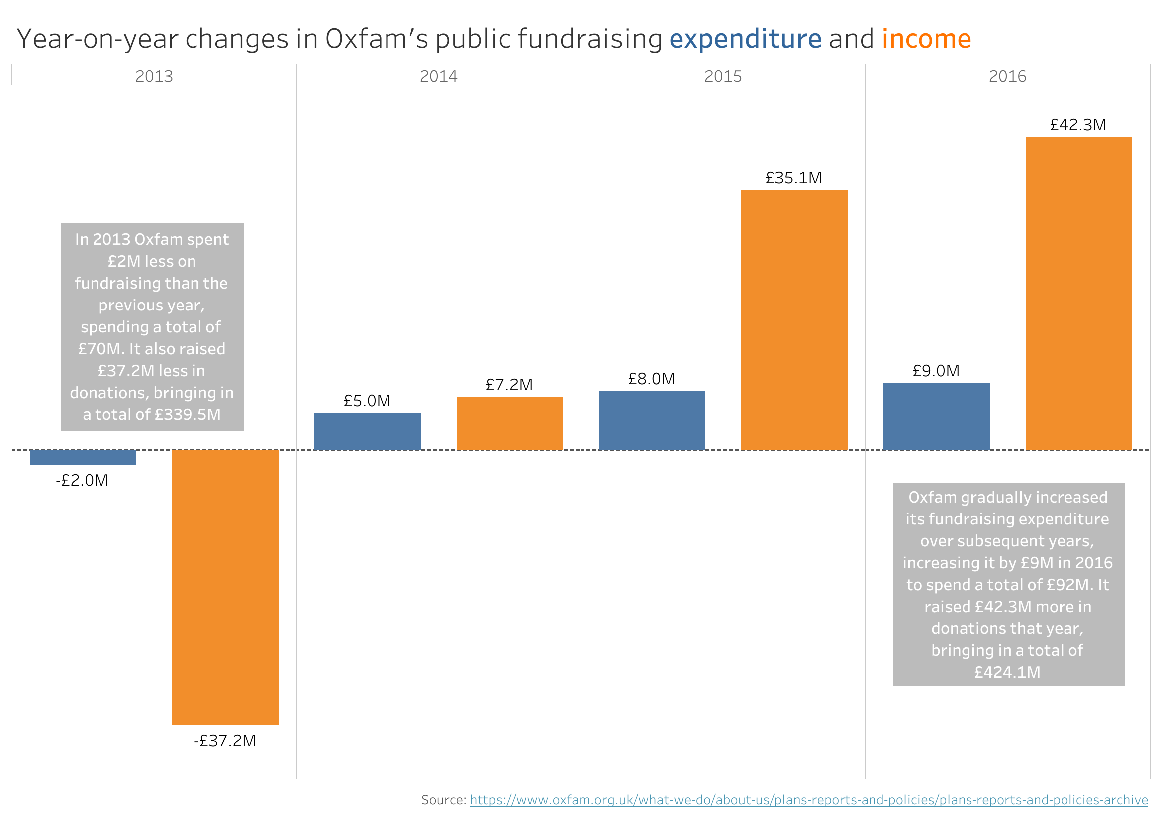
Background
In early 2018, Oxfam featured heavily in the media for the appalling behaviour of a member of its staff in Haiti following the earthquake in 2010. There was a lot of talk subsequently about ineffective safeguarding procedures, but few people were willing to say the obvious: charities need to spend money on things like processes and procedures to prevent this sort of thing from happening, even though donors don't want their money being spent on anything other than the cause itself. Although the Oxfam crisis strengthened the case for investing in safeguarding procedures, the case for investment in fundraising has always been much harder to make - so I decided to show the benefit of increased fundraising investment, using Oxfam's own annual reports as my dataset. I blogged about the whole thing here, and I was pleased to see it gaining a lot of attention from my peers in the fundraising sector.
What I like about this visualisation
After a year of posting nothing to Tableau Public, I returned with a piece that stripped things right back to bars, annotations, and two colours. What I'm particularly pleased with is not so much the visual design as the way I chose to present the data, looking at the year-on-year change in fundraising investment and fundraised income. The pair of annotations reinforce the point, but I think the visualisation does the job well enough on its own: as Oxfam put more money into fundraising, it raised a hell of a lot more too. By now I was citing my sources as standard, and again I made use of colour labelling in my header text rather than insert a separate label.
Conflict in Israel & Palestine
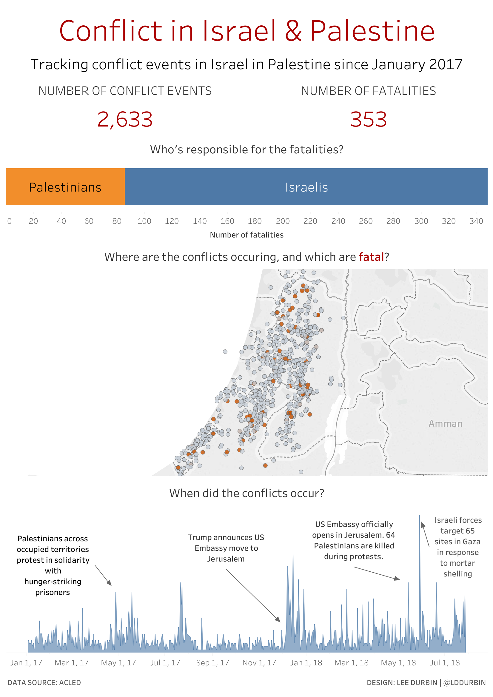
Background
After a lengthy hiatus I returned to Makeover Monday, with a vow to participate more regularly. This dataset concerned conflict events, and as there were many different ways to tackle the data I decided to focus on one set of conflicts in the Middle East: between Israel and Palestine.
What I like about this visualisation
I'm especially proud of this for several reasons: I found an interesting story in the kind of rich dataset that would have overwhelmed me previously, I used three different but carefully-chosen chart types, I kept my colour choices simple, and I used limited text and annotations to tell the story that mattered. It combines the simplicity of the big numbers at the top with the complexity of the numerous conflicts that are dotted across the map and tracked in the area chart. The area chart even looks to me like a seismograph, an appropriate visual cue given that this is a conflict primarily about land. Although the design draws heavily on Eva Murray's makeover, I feel that I've found my own story to tell here and made good choices to tell it.
Wealth of the Wearables
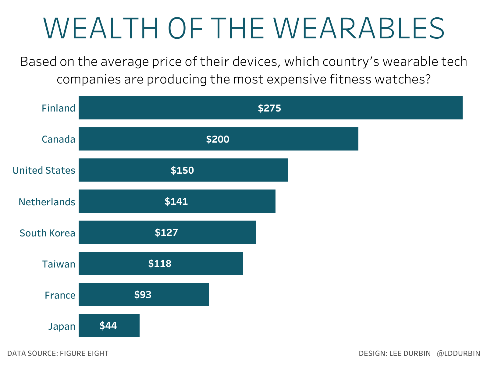
Background
The first time I've completed two consecutive Makeover Mondays, which feels like an achievement given that I was on the verge of abandoning this one. The data looks at which body parts we're attaching computers to.
What I like about this visualisation
I feel like I've come full circle with this, my latest visualisation in the form of a simple bar chart. As I used Eva Murray's makeover as my starting point last week, this time around I took inspiration from Andy Kriebel's effort but made a few small changes: I moved the labels onto the bars themselves (I like the contrast of the white text against the darker background), I didn't bother with the rounded edges (although it looks cool it can be misleading), and instead of looking at average price per company I looked at average price for each country the companies are based in. The greatest challenge was actually finding a way to describe what I was showing in a short sentence, but phrasing it as a question helped. Eva suggested sorting the bars in descending order by average price so the viewer can answer that question faster (they were originally sorted alphabetically), and that's what I've done here. I'm glad I persevered - even though at first this didn't feel like progress at all (it's only a bar chart!), simply being at peace with a basic chart type is progress in itself, especially one that somehow looks a lot cleaner than my very first one about NHS Wales.