One of my resolutions for 2018 is to improve my Tableau skills, which stalled somewhat in 2017. That isn't to say I learned nothing, but most of that learning came about because of work I had to do as part of my day job - and not because I was pushing myself outside of that. With this in mind, I downloaded the first Makeover Monday dataset of the new year and got cracking.
Now, I'm not entirely new to Makeover Monday - I participated on three previous occasions (here, here, and here), but if there's one thing I've come to realise with Tableau it's that learning in my case has to be a continuous process for it to stick, and an odd Makeover Monday submission here and there doesn't give me the sense that I've achieved much. It's like any skill in that regard - if you only practice it sporadically, then your improvement isn't going to be anything other than incremental.
Another difficulty I've experienced is the sense that my own makeovers pale in comparison to the works of art that other Tableau enthusiasts seem to turn out on a weekly basis, and that does make it hard to motivate myself to even get started on these things. Makeover Monday is so public, and even though we're reminded it's not a competition that doesn't stop my own inner critic from treating it like one, and of course comparing what little I can achieve against the masterpieces I see all the time on Twitter is also going to feel like defeat.
So, it's clear: I need to get involved with this initiative regularly, and I need to keep reminding myself that I'm doing it entirely for myself. It's perfectly fine to admit that, even after using Tableau for over two years, I still know very little - but it's through engaging with (and documenting) this process that I'm going to do better. Here we go then...
The data for week 1 is about how the U.S. consumption of poultry and livestock has changed since 1965, and Andy Kriebel has posted a simple but effective makeover (see the image at the top of this post). What better way to get into the habit of Makeover Monday than re-creating that? It looks like it's within my skill level, it shouldn't take long, and because it's not my own original effort I won't feel the need to compare myself to anyone - perfect! I can put off designing my own makeovers until next week.
I can see straight away that the data doesn't look how I'd expected - it's been pivoted, so I need to transform this. I've recently been using EasyMorph for some basic data manipulation, so let's use that in order to wrangle this data into shape (maybe this is possible straight in Tableau, but I just don't know how - and I'm much more comfortable working with something like Alteryx or EasyMorph for this upfront work anyhow).
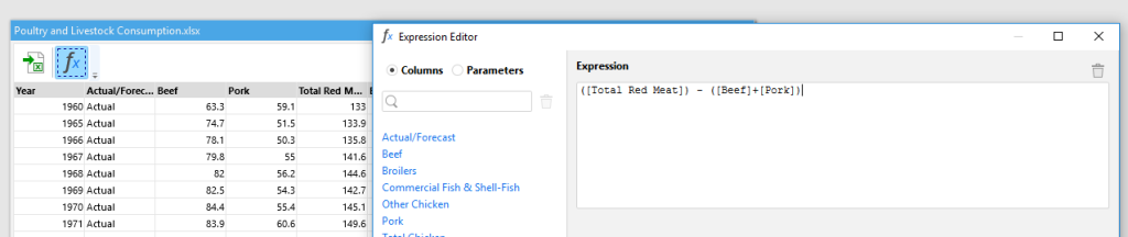
I don't know at this point whether or not I am going to attempt my own makeover, so I decide to clean the data in a way that will allow me to should I choose to go down that route. Straight away I can see that the "beef" and "pork" consumption don't add up to the "Total Red Meat" field, so once I've pulled the original data into EasyMorph I then write a simple formula to get the missing data for a new column I call "Other red meat":
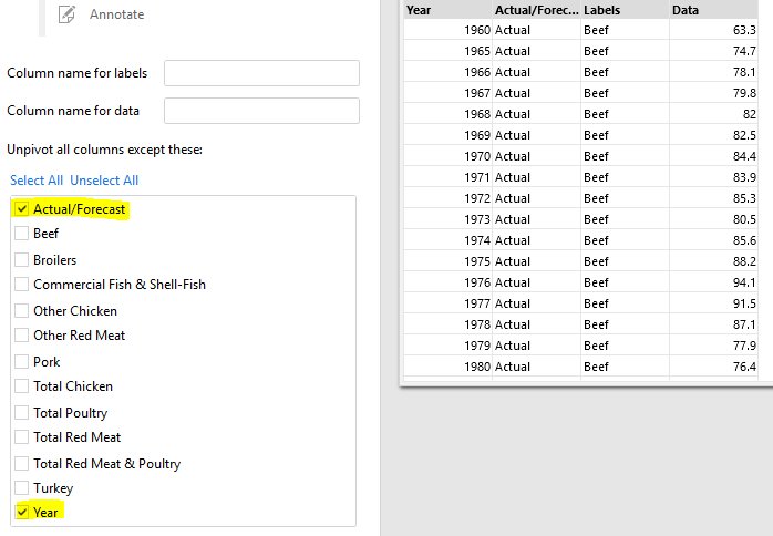
Alright, now I can un-pivot the data on all columns other than my two fixed ones:
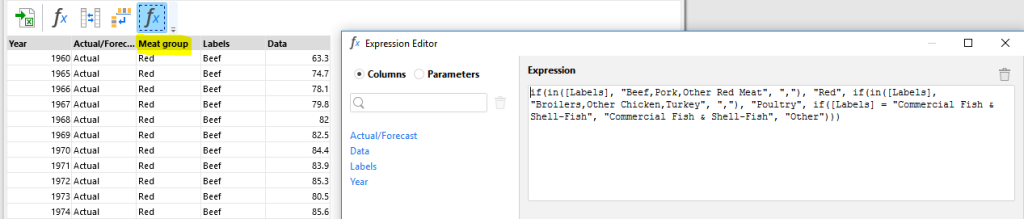
Now I want to play around with some groupings just in case I want to explore the data for myself, so I write a longer formula to combine the red meats, poultry, and fish into separate categories (all of the surplus "total" fields will go into "Other"):
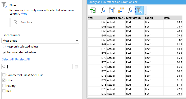
And finally, I remove the rows I've grouped into "other" so I don't have the totals in my data (I can get those in Tableau anyway):
Brilliant, this should work just fine - but is it still correct? The original visualisation won't tell me that as Andy confirmed that the data provided differs from that used in the chart. Therefore, I download Andy's own workbook, and get the consumption values in my data for the three meat types under consideration for both 1965 and 2017:
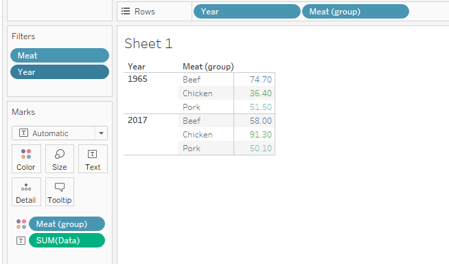
This matches back to what's in Andy's visualisation, so I'm reasonably certain nothing went awry during the EasyMorph transformation. Time to reverse-engineer Andy's chart!
I immediately ran into a problem here: how does Andy show the change from 1965 like that? As much as I wanted to re-create his visualisation myself, my dependence on ETL tools means I'm hopeless at this in Tableau, so I peek at his calculation:
(ZN(SUM([Per Capita Consumption])) - LOOKUP(ZN(SUM([Per Capita Consumption])), FIRST())) / ABS(LOOKUP(ZN(SUM([Per Capita Consumption])), FIRST()))
Let's break this down: first, he's taking the sum of the Per Capita Consumption (I assume it's wrapped in a ZN in order to return zero if there's a null?) and subtracting from that the Per Capita Consumption for 1965 by using LOOKUP to get the FIRST row of data. Finally, he's dividing this difference from 1965 by the Per Capita Consumption for 1965 (I'm not sure why the need for wrapping it in ABS though?) - and from that he gets the percentage change. Alright, that sort of makes sense.
Now that I have this change from 1965, I can quickly create a line chart for the three meat types once 1960 and 2018 have been excluded:
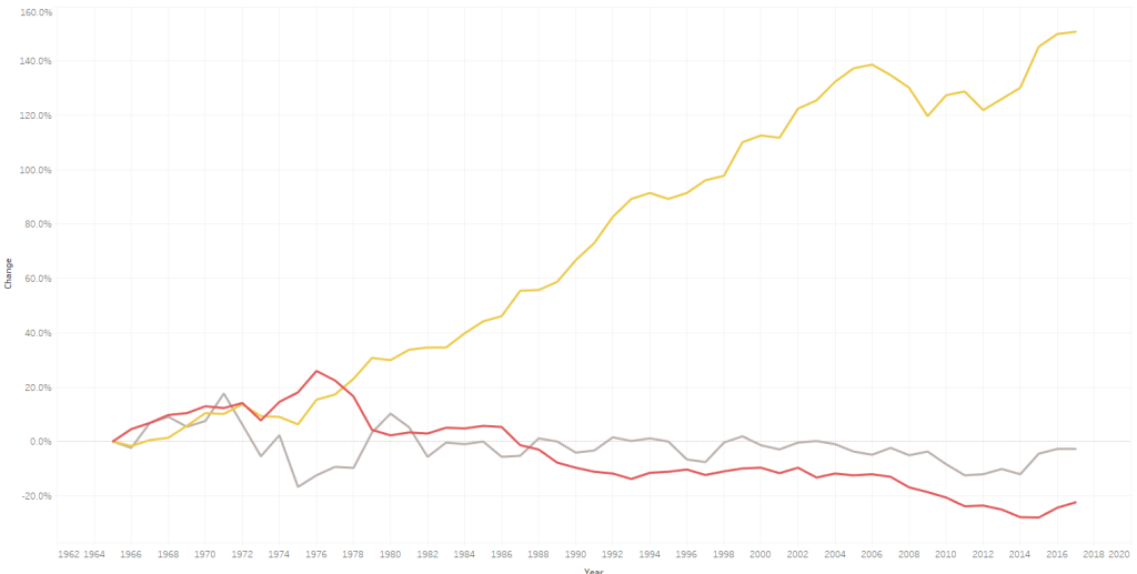
This already looks a lot like Andy's finished result, and it's all just formatting from here. Simple, right?
Well actually, I ran in to some trouble here. It's easy enough to remove the grid lines, make the Zero line a little more prominent, change the background colour, ensure the text on the axes pops out a bit, and remove the title of the X-axis because those are obviously years. Nevertheless, when I drag the change from 1965 onto Labels I get precisely what I'd expected...
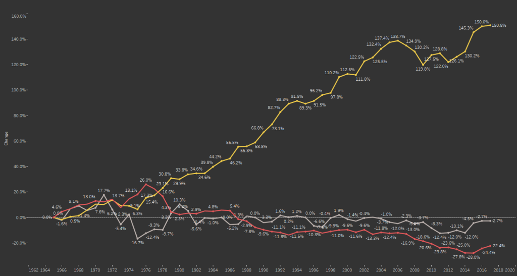
I only want the label for the last value against each line, and I spend the next quarter of an hour scratching my head over this one. I just can't figure out... until, that is, I accidentally hover over the Label pill for long enough to see "Label - drag dimensions or measures here, or click for more options". Click for more options...?
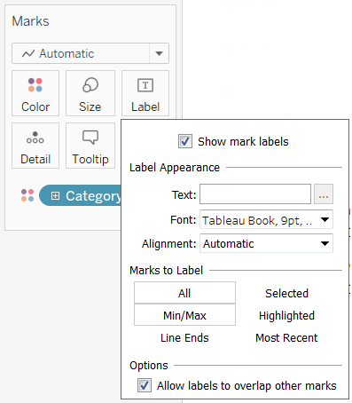
Yes, Label options - a feature hitherto unknown to me! And it's right here that I can label only Min/Max, untick "Label minimum value", and select the "Year" field so the labels appear at the end of each line. And so, from recreating such a seemingly simple chart I've used something in Tableau that in the past I'd entirely overlooked!
At this point I was content to leave it there, my only gripe being that the end-of-line labels weren't coloured to match the lines themselves. But perhaps that's something for another day, given that I'd already achieved my aim here: despite not contributing any original material of my own for Makeover Monday, I was still involved in the initiative for the first time in a year, and most importantly of all I was learning things again.
Join me again next week as I discover more basic features of Tableau that I'd entirely overlooked for the last two years!