So before I begin, it's worth noting that this post has nothing to do with fundraising, although it does concern UK universities. As such, I've tweaked the subheading of this blog to reflect the fact that I'm writing as much about data analysis outside my own job as I am within it: "Data discoveries in UK university fundraising & beyond".
And with that out of the way, I wanted to talk a bit about the process behind the latest visualisation I've created. Here it is (click the image to open an interactive version):
This came about after I was invited to submit an entry to the #Vizforsocialgood initiative coordinated by Chloe Tseng (@datachloe). Chloe had pointed out that all entries for the latest project, which you can read about here, had come from women and she was keen for men to submit something too. I felt that it was right for men to show their support for gender equality by participating in this, and so I took up the challenge. I'd actually visualised a problem with gender inequality recently and it received an overwhelmingly positive response (you can read about it on my other blog), so I was pleased to get involved here too.
The first challenge was to find the data. The brief I chose asked for "a infographic to show the challenges for women in STEM", which is pretty broad and might be approached in any number of ways. My partner suggested that I look to Athena SWAN, a charter "established in 2005 to encourage and recognise commitment to advancing the careers of women in science, technology, engineering, maths and medicine (STEMM) employment in higher education and research", and which was expanded in 2015 to "recognise work undertaken in arts, humanities, social sciences, business and law." You can read all about this initiative here, via the Equality Challenge Unit (ECU).
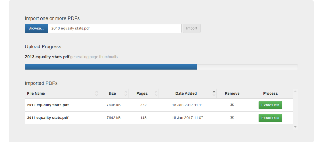
The ECU work with HESA, who "collect, process and publish data about higher education (HE) in the UK" and you can visit their website here. The ECU study the data provided to them by HESA and publish an annual report on equality in higher education, which are all freely available on their website. Since 2014 the ECU has also provided the underlying data in Excel too, but I decided early on that I was interested in looking at gender representation in STEM subjects across a longer period, so I knew that simply getting the data would be the first challenge.
Having downloaded all of ECU's reports since 2011 (specifically those providing an equality-focused analysis of information on staff at UK HEIs), I then needed to extract the data. For this I turned to Tabula, "a tool for liberating data tables locked inside PDF files". This allowed me to pull through the relevant data from ECU's PDFs, and even though it was available to me in Excel from the 2014 report I just ploughed on with Tabula nevertheless:
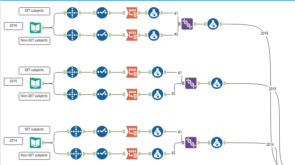
Even though I now had the data saved to CSV files, it wasn't really in a fit state to work with in Tableau, which is ultimately where I intended to create the final work. Looking at the data, I could see that there were a number of similar steps I needed to follow for each of the six files:
- Drill down to only the necessary rows of data for SET (science, engineering, and technology) and non-STEM subjects (ultimately I didn't visualise anything about the latter group but I didn't know that at the time)
- Rename the fields to something more useful
- Re-shape (or transpose) the data from "short and fat" to "tall and thin"
- Add a single tag for STEM and non-STEM subjects
- Add some other helpful tags to the data (STEM/non-STEM, year, male/female, volume/share)
- Convert anything measured as a proportion to a decimal
- Bring everything into a single dataset and export it to Excel
As luck would have it, I'm already familiar with a tool that's perfect for this: Alteryx! I set to work building a workflow, which isn't my finest by any means but it did the job:
The end result of all this is that I have a dataset which shows, for each SET subject, the volume and share of male and female staff members across UK HEIs for each academic year between 2010/11 and 2015/16. If you'd like to explore this prepared data for yourself, (or indeed the above Alteryx workflow and the final Tableau viz) then you can find it in this Git repository that I've set up.
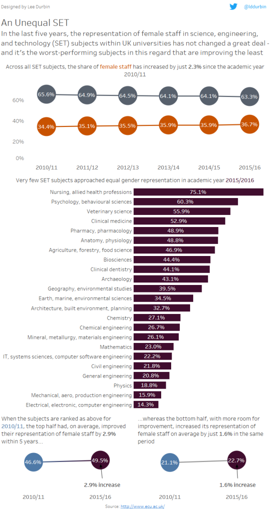
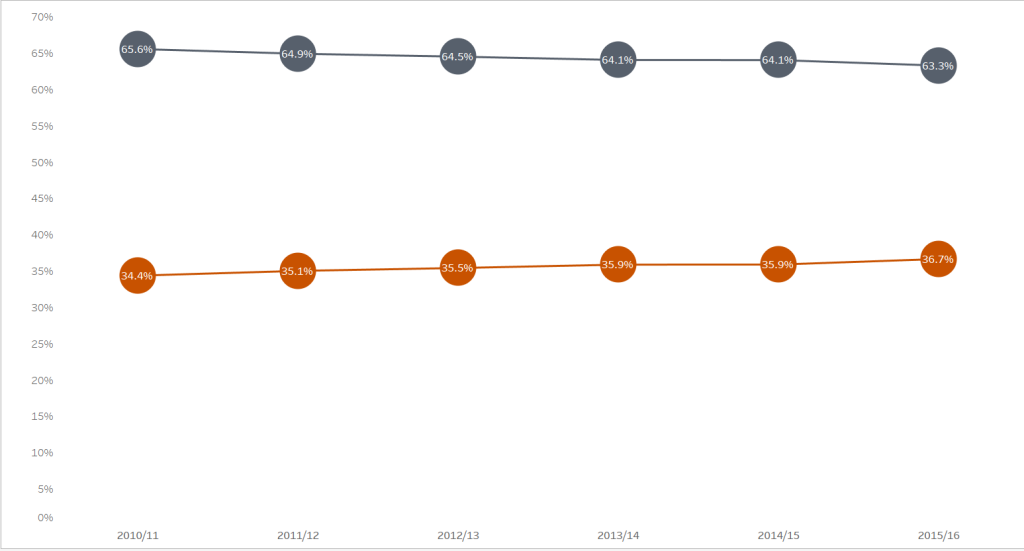
As I began to explore this data in Tableau I realised quickly that the first story I wanted to tell was about the macro-level change over the years: how has male vs female staff representation in SET subjects within HEIs changed between the academic year 2010/11 and 2015/16? This was a fairly straightforward dual-axis technique which combined a line chart with a circle chart, using two contrasting colours to show the share of male vs female. With the values shown in the circles the y-axis wasn't strictly necessary, but when I positioned it in the dashboard I wasn't happy with the amount of white space between the bottom line showing female representation and the x-axis, and so by reinstating the y-axis I felt that it bridged that divide somewhat - acting as a framing device, if you will:
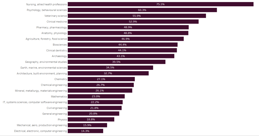
Next up I knew that I wanted to drill down to the micro-level: how did individual subjects perform in the most recent report? A simple bar chart would do here, placing the subject with the highest share of female staff on top and the one with the lowest share on the bottom to make it easy for the viewer to pick out the best (nursing and allied health professions) and worst (electrical, electronic, and computer engineering). This required some further data wrangling that I could have perhaps achieved in Alteryx but is also easy to do in Tableau: I needed to group the same subjects together whose labelling had changed over the years. Once I'd dealt with that I was good to go:
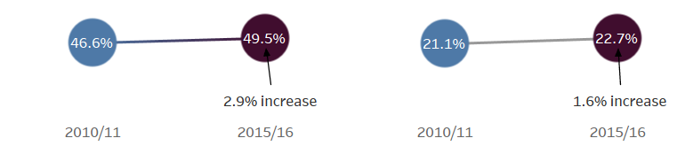
So where to go from there? Well, I struggled for a while with this because I felt like there was more of a story to tell. I first tried exploring how the share of female staff had changed within each subject over the period under examination, but I wasn't sure what the reader was supposed to take away from that. My partner took a look at what I'd had and immediately saw that the subjects at the top of the table had improved more than those at the bottom, and from that observation it became clear to me that the story here was about how the subjects with the most room for improvement had increased their representation of female staff less than the subjects that were already performing well in this regard. I therefore grouped the subjects again, this time based on their 2010/11 ranking - simplifying that table into the top half and the bottom half. A simple slope chart did the trick of visualising the change, together with an annotation stating the actual percentage increase:
Finally, I brought it all together in a dashboard with just enough text to guide the viewer along, adding colours where appropriate to match those used in the charts. I also ensured that the colour of the bar chart matched the colour I'd chosen for 2015/16 in the slope chart, which was another way of reminding the reader that the bar chart showed the subject ranking for 2015/16. It tells, I think, a clear and simple story in three parts:
- The share of female staff in UK HEI SET subjects has increased very little over the last five academic years
- Whilst some individual subjects perform better than others, few approach equal gender representation and many are pretty dismal in this regard
- The subjects that have the most room for improvement have increased their share of female staff less than those that were ranked above them
I hope that you take something away from this, not just the story told in the chart but also the story of its creation. If you have any suggestions for either how the process might have been improved (it took all day!), or how the final piece might have told the story more effectively then do let me know.