My gateway drug to working with data was the same as everyone else: Microsoft Excel. It wasn't until 2020 that I switched to using R, and I gave an entire conference talk about that transition which you can watch below:
But it's 2026, and you'd be forgiven for thinking that hand-writing code is a thing of the past now. While that's not entirely true (yet), it is the case that the rapid advancement of generative AI in the last few years streamlines the process of building things with code.
So what does this mean for working with data, and specifically for visualising data? Well, it means that you can create high-quality charts with AI in a fraction of the time it would usually take to make them with other tools.
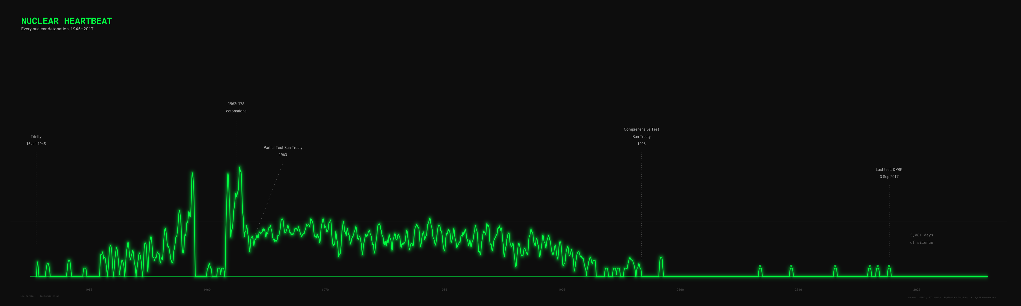
In this post I'm going to show you how I used AI to build this chart:
With just a few tweaks, you can apply this method to make your own data visualisations in minutes instead of hours.
The data
The idea for this chart came from Fix the News, which shares "hidden stories of progress". I was struck by one of their recent headlines: The world just passed eight years and four months without a nuclear explosion.
I wanted to be able to see this, but first I needed the data. Usually I would scour the Internet myself until I found an authoritative source, but we can leverage AI to strealine things right from the beginning.
My AI provider of choice is Claude, and its terminal-based coding tool Claude Code. So, I began by asking Claude for a dataset of all nuclear explosions up to the present day, and it came back with a few suggestions. I opted for this one courtesy of Data is Plural. Only one downside: it doesn't include the more recent nuclear tests in North Korea, so Claude supplemented the original dataset with those (it used Wikipedia as a source).
Ideation
Ok, so I had the data. Now what?
Coming up with idea for how to visualise data in a way that's clear and impactful can be tricky, but again this is where Claude shines. So I asked it to help me out:
Without downloading anything or writing any code, can you maybe brainstorm some ideas for how to visualise this? So for example we could chart the number of days since the last nuclear test over time, or we could just show the total number of tests per year. And perhaps along with each of those ideas describe how you might actually present this visually in an interesting way to be shared with a wide audience.
Claude was pretty generous with its response. Here's what it gave me:
1. The Growing Silence
Your idea about days since the last test is really compelling. Imagine a single rising line or counter that accelerates upward after 1998, with the occasional North Korean test resetting it briefly. The visual power is in how the gaps between tests stretch from hours (during peak Cold War testing) to years and now nearly a decade. You could present this as an animated counter or a bar chart where each bar represents the gap between consecutive tests — the bars would be tiny slivers for the 1960s and then dramatically tall at the end. It tells a hopeful story.
2. A Heartbeat Monitor
Plot every single detonation as a pulse on a timeline, like a seismograph or ECG trace. During the late 1950s and early 1960s the "heartbeat" would be frantic and almost continuous, then it calms after the Partial Test Ban Treaty in 1963, has periodic surges, and eventually flatlines after 1996 with only the faint occasional North Korean blip. This works beautifully as a horizontal scrolling animation or a long-form infographic. The visual metaphor of a heartbeat slowing and stopping is immediately intuitive.
3. The Cumulative Weight
A stacked area chart showing cumulative tests by country over time. The US and Soviet Union dominate as massive coloured bands that grow steeply through the 1950s–80s, with thinner bands for France, UK, and China layered on top, and then tiny slivers for India, Pakistan, and North Korea at the end. The power here is showing who was responsible for what proportion and when. The curve flattening at the top tells the story of restraint.
4. A Calendar Heatmap
Every year as a row, every day as a cell, coloured by whether a test happened that day. The 1960s rows would be lit up like a switchboard; the 1990s onward would be almost entirely dark. This gives a visceral sense of just how routine nuclear testing was during peak Cold War — some days had multiple detonations. It works well as a static poster or interactive web piece where you can hover for details.
5. Two Clocks
A split-screen concept: on one side, show how many days the world went between tests during the busiest year (1962 had 178 tests — roughly one every two days). On the other side, show the current streak since September 2017. The contrast between "every 48 hours" and "nearly 3,000 days" is staggering and needs almost no explanation.
6. A Map That Lights Up
An animated globe or world map where each test appears as a flash at its geographic location, playing through time on an accelerated timeline. Nevada and Semipalatinsk would strobe almost continuously, the Pacific atolls would flare during atmospheric testing periods, and then everything goes dark. This has been done before (Isao Hashimoto's famous video is the classic version) but it remains one of the most powerful ways to convey the data because it grounds the abstract numbers in real places.
7. The Yield Skyline
Instead of just counting tests, plot each one by its explosive yield as a vertical bar on a timeline — like a city skyline. The Tsar Bomba (50 megatons, 1961) would tower absurdly over everything else, and you'd see how yields generally decreased over time as testing shifted underground and focused on miniaturization. This tells a more nuanced story about what was being tested and why.
8. Nations Entering and Exiting
A Gantt-chart style visualization showing each country's active testing period as a horizontal band: the US starting in 1945, the Soviets joining in 1949, then UK, France, China, India, Pakistan, North Korea. You see the club growing while the original members stop. It frames the story as one of proliferation versus restraint simultaneously.
After reading through these, I went with Option 2 - the heartbeat monitor. Time to get to work!
The code
It was nearly time to switch over to Claude Code, but it was hard to know where to begin. I knew I wanted Claude Code to build this using R, so I asked Claude to help me write instructions to pass in to Claude Code:
I really like the second idea. Could you describe that in more detail as a prompt that I could use for Claude Code? I'm going to be using R, ggplot2, any other R packages I need to visualise this. It needs to look striking.
What I got back was a set of extensive instructions for Claude Code, inluding links to the data. Here it is:
Project: Nuclear Heartbeat — ECG-style visualization of every nuclear explosion from 1945 to 2017
Overview
Create a striking, publication-quality visualization in R that plots every known nuclear detonation (approximately 2,058 total) as a pulse on a horizontal timeline, styled to look like a heart monitor / ECG trace. The visual metaphor is that nuclear testing was the "heartbeat" of the Cold War — frantic during the arms race, calming after treaties, and eventually flatlining with only faint North Korean blips at the end.
Data
Use the SIPRI/FOI dataset of nuclear explosions 1945–1998. This is available as a CSV from this GitHub gist: https://gist.github.com/ZijunXu/7568f9c7ad6363c273ece8455e3675db
The raw file URL for the CSV is: https://gist.githubusercontent.com/ZijunXu/7568f9c7ad6363c273ece8455e3675db/raw/nuclear_explosions.csv
This dataset covers 1945–1998. You will need to manually append the 6 North Korean tests that occurred after 1998:
- 9 October 2006
- 25 May 2009
- 12 February 2013
- 6 January 2016
- 9 September 2016
- 3 September 2017
For the appended North Korea rows, set the country to whatever the country code convention is in the dataset. The key fields you need are the date and the country. Yield data for the NK tests is estimated but not critical for this visualization.
Visual design
The x-axis is time (1945–2025, giving some whitespace after the last test to emphasize the silence). The y-axis represents detonation activity.
The core mechanic: For each detonation, draw a sharp vertical spike upward from a flat baseline (zero), like an ECG R-wave. Where tests cluster closely together (e.g., 1962 had 178 tests), the spikes should merge into a dense, almost frantic-looking waveform. Where tests are sparse (post-1998), you get isolated lonely blips with long flat stretches of silence between them.
Approach to building the waveform: Rather than plotting 2,058 individual lines, consider binning the timeline into small intervals (e.g., weekly or biweekly bins) and plotting the count of detonations per bin as the height of the waveform. Then connect these as a continuous line that returns to zero between active periods. This will naturally create the ECG effect — dense rapid oscillations during peak testing and isolated spikes during quiet periods. Experiment with bin width to get the right balance: too wide and you lose the spiky ECG feel, too narrow and it becomes a barcode. Something like 7–14 day bins might work well. You could also try a different approach: use the actual dates and draw literal spike shapes (up-and-back-down) for each test or small cluster, connected by a flat zero baseline. Try both approaches and use whichever looks more like an actual ECG trace.
Colour: Use a dark background (near-black, like a hospital monitor screen — something like #0a0a0a or #111111). The main trace should be a bright, slightly phosphorescent green (#00ff41 or similar "terminal green"). Consider adding a subtle glow effect around the line using a slightly wider, more transparent version of the same line drawn underneath. The overall feel should be like looking at an old CRT monitor.
Annotations: Add minimal, cleanly placed annotations in a monospace or sans-serif font (light grey or dim green) for key moments:
- "Trinity" at 1945
- "Partial Test Ban Treaty" at 1963 (the shift from atmospheric to underground testing, which might show as a change in pattern)
- "Comprehensive Test Ban Treaty" at 1996
- "Last test: DPRK, 3 Sep 2017" near the final blip
- Optionally mark the peak year: "1962: 178 detonations"
Annotation lines/arrows should be subtle and not clutter the visualization.
Typography: Use a clean sans-serif font throughout. The title should be prominent and positioned at the top left. Title: "NUCLEAR HEARTBEAT" as a main title with a subtitle like "Every nuclear detonation, 1945–2017" beneath it. Consider a monospace font for the title to reinforce the monitor aesthetic.
Axes: The x-axis should show decade markers (1950, 1960, 1970, etc.) in a subdued colour. The y-axis should either be hidden entirely or very minimal — the absolute count isn't the point, the shape is. Remove all default ggplot grid lines, ticks, and chrome.
Dimensions: Output as a wide landscape PNG (approximately 4000 x 1200 pixels, or 20 x 6 inches at 200 dpi) so it has that wide panoramic ECG-strip feel. Also output a version at 1920 x 540 for social media sharing.
Technical notes
- Use R with ggplot2 as the primary plotting package
- Use additional packages as needed: lubridate for dates, showtext or sysfonts for custom fonts (try "Roboto Mono" for the title, "Roboto" for other text — load from Google Fonts via showtext), dplyr for data manipulation, ggforce or ggfx if you want glow/blur effects
- If glow effects prove difficult, don't let them hold up the main visualization — a clean bright line on dark background is striking enough on its own
- Save output to the working directory as PNG files
- Make the code clean and well-commented so I can tweak parameters like bin width, colours, and annotation positions
Quality bar
This should look like something you'd see in a data journalism piece from Reuters Graphics, the New York Times, or The Pudding. It should make someone stop scrolling.
The visual
At this point I switched over to Claude Code, and passed it the above prompt generated by Claude. This is what I got from its first attempt:
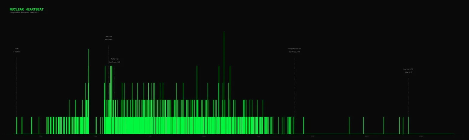
Many people would stop here and conclude that AI tools can't make good charts. But who gets these things right on the first try?
So I shared the visual with Claude, and asked it to evaluate what it saw based on its understanding of what we were aiming for. It observed that "the aesthetic is in the right ballpark (dark background, green, annotations) but it reads as a bar chart, not a heartbeat."
It critiqued some specific areas, and asked if I wanted it "to write a refined follow-up prompt you can send back to Claude Code addressing these specific issues". I did, and based on those instructions Claude Code tried again:
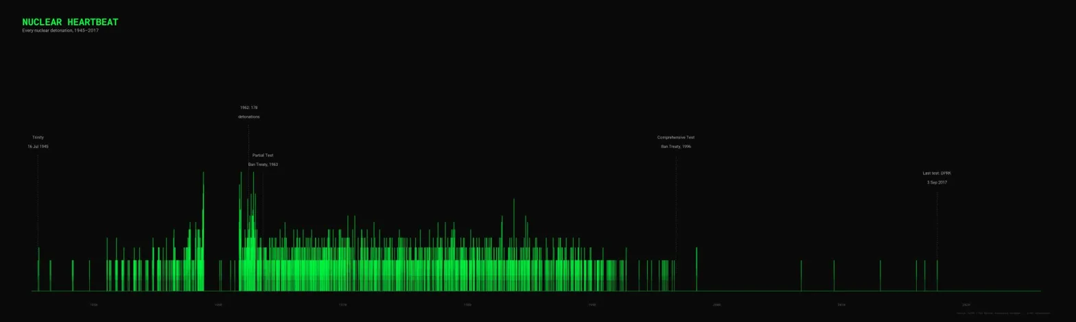
Iteration, iteration, iteration. This was an improvement, but it still wasn't quite what I had in mind. When I shared the image with Claude it noted that "the dense middle section is still a green wall [...] there's no real sense of a continuous trace [and] the glow is subtle to the point of being invisible at normal viewing size."
It gave me another prompt to pass to Claude Code, but as the prompt was quite extensive I decided to switch Claude Code into plan mode. Instead of executing code, I shared Claude Code's plan for the work with Claude. Aside from a few minor things it advised me to look out for, it recommended that I go ahead and execute the plan. Here's what we got this time:
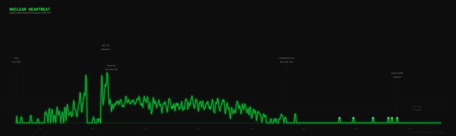
You'll notice that we're now pretty close to the end product, and it was only minor tweaks from here (e.g. the placement of certain annotations).
Conclusion
What can we learn from this? Well, I learned that generative AI tools are capable of creating clear and impactful data visualisations - but with some caveats.
First, you need a clear idea of what you want to do with the data - but the AI itself can help you think that through.
Second, you need to use the right tools for the job - in my example, I used Claude for ideation and feedback, and Claude Code for technical planning and execution.
Third, you're unlikely to get what you want the first time - but with a little iteration (aided by Claude in this case), you will get there.
So give it a go yourself - try it with Claude and Claude Code, or ChatGPT and Codex. Play around, be patient, and you can guide the AI agent to produce some incredible data visualisations in much less time than if you did it from scratch yourself.