It was 2019, I’d just moved to New Zealand and landed an interview for a job as a data analyst. They wanted me to present some of my work using Power BI. The problem was, I’d never used Power BI before. So what exactly was I going to do?
When you get interviewed for a data analyst role, you’ll be probably be asked to make a presentation to the interview panel. In this post I’m going to walk you through what I showed, and crucially what I said about it in order to secure the role.
If you'd prefer to consume this content as a video then you'll find it below, otherwise read on...
The dashboard that got me into trouble
Ok, so what exactly did I present to the interview panel on that day?
Before we get to that, let’s wind the clock back about three years before I was preparing for that interview. I was living back in the UK then and had some free time on my hands during the Christmas break, so I decided to undertake a little data visualisation project. Because that’s what you do on your Christmas break, right?
I was standing around thinking what I could base my project on, when an idea hit me.
Being a history buff, I was an avid reader of History Today magazine, and I’d kept all the copies delivered to my door that year.
There was something I noticed about a lot of the articles in the magazine: most of them seemed to be written by men. And most of the historical figures being written about seemed to be men. And most of the books being reviewed seemed to be written by men. And most of the reviewers themselves seemed to be men.
You get the picture.
But was it true? To find out, I flicked through each issue of the magazine and gathered lots of data to answer the following questions:
- Out of all the articles and book reviews, how many appeared to have been written by women?
- When an article focused on a named individual, how many of them were women?
- Of all the books reviewed, how many of those books were written by women?
Once I had all that data, I built a dashboard in Tableau. And here’s the result!
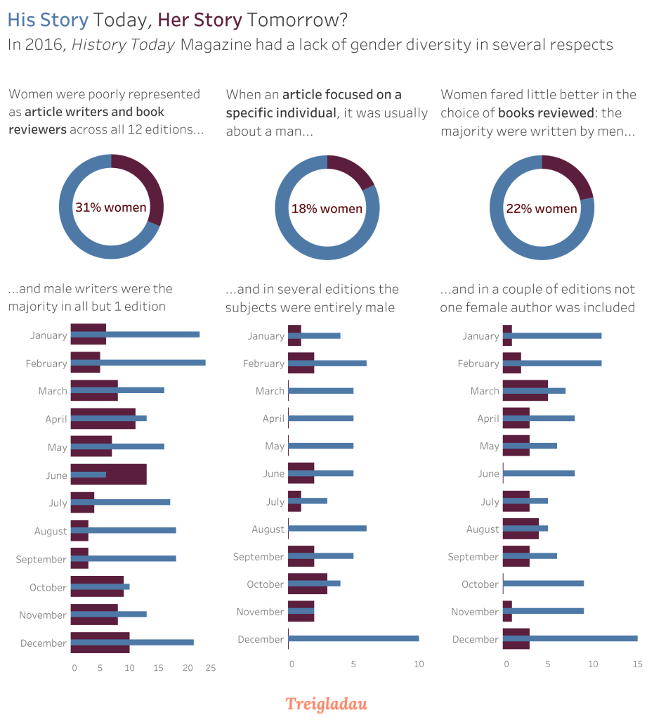
As you can see, less than third of the articles and book reviews were written by women. When an article focused on a specific historical figure, nearly eight times out of ten that person was a man. And out of all the books reviewed in the magazine, only about a fifth of those books were written by women. There were a couple of occasions where every book they reviewed in the magazine was written by a man.
I’m not going to dive into why I think this isn’t ideal. If you want to learn more about why this bothered me then you can read all abut this in another blog post.
Anyway, I published this on Tableau Public, wrote a blog post, and tweeted about it. And then a strange thing happened: I was accused of erasing women’s contributions. Off the back of a piece about the lack of female representation in a history magazine!
Even now, some eight years later that still seems wild to me. If you want more of the background to that saga, I archived a Storify where you can about what happened.
That accusation aside, the response was overwhelmingly positive. One or two contributors to the magazine tweeted their support of what I’d found, and the magazine’s editor even wrote a response:
We are indebted to Lee Durbin for his ~remarkable piece of data analysis,~ which has confirmed the gender imbalance among History Today contributors.This is an issue that everyone at History Today is well aware of and it has been the subject of many conversations and planning meetings. As a result it is something we have been consciously and proactively trying to fix. We hope the effects of this will soon become clear. It is certainly not something we are complacent about.[…]To echo Mr Durbin’s closing thought: ‘Here’s hoping for better in 2017.’
There was one other thing that happened off the back of this: Dr Fern Ridell tweeted out encouragement for female historians to pitch their articles to the magazine, and many did of them did.
I didn’t track the magazine’s progress during 2017 or since but I cancelled my subscription (not because I had a problem with it, but because I couldn’t afford it at that time). If anyone out there reads History Today Magazine then let me know - have things changed over the last 7+ years?
The interview
Let’s jump back ahead to three years later, with me in New Zealand preparing for that interview.
The hiring manager had asked me to show them what I could do using Power BI, but I’d never used Power BI. Could I pass off one of my Tableau visualisations as a Power BI dashboard? No, that wouldn’t be right.
Then it hit me: it’s not about the tool.
I realised that I could reframe the conversation to focus not on the tool I couldn’t use, but on the impact I had had with my History Today dashboard, and the choices I had made along the way.
When you’re presenting data to an audience, which was precisely what I needed to do in this situation, they’ll pay more attention to what you’re saying, and they’ll remember what you said, if you tell a story. Stories are powerful, stories are what make us human, and presenting data without a story is like looking singing a song that’s out of tune; maybe the lyrics are correct, but it’s the melody that matters.
So here’s what I did.
I told the interview panel the same story I’ve told you today. I told about that time I stood around trying to think of something interesting to visualise. I told them about History Today Magazine and all the hard work I did to gather the data. I told them about how the dashboard I built clearly showed what I’d found, the under representation of women in the magazine. And I told them about the impact that piece had had, both good and bad.
Did it matter that I hadn’t built it in Power BI? Not in the slightest. The interview panel loved the story, they didn’t really care that I hadn’t used Power BI before: what mattered was that I could distill some important findings into a simple visual, and what really mattered was that I could the story behind that visual in a way that captivated the audience.
It’s not about the tool. It’s about communicating insight and making a difference. You could be the most talented Power BI user in the world, but if you can’t tell a story with data then the tool is kind’ve useless.
That’s what I learned that day, and that’s what landed me the job. The hiring manager later told me: “it wasn’t even close.”
Conclusion
If there’s one thing I’d like you to take away from this post it’s this: don’t get hung up on the tools and technologies. Find something that interests you, maybe even something you’re passionate about, and tell a story around it using data.
And who knows? Maybe one day you’ll have an opportunity to share that story with your future employer during your interview, and your enthusiasm will shine through. It worked for me, and it just might work for you.